Mobile-first web-to-print is rapidly becoming the standard as the way customers interact with print businesses has fundamentally shifted. Today, nearly 60% of web-to-print orders start on a mobile device. For web-to-print business owners and managers, embracing a mobile-first approach isn’t just a trend – it’s mission-critical for driving growth, improving customer experience, and staying ahead of the competition in 2025.
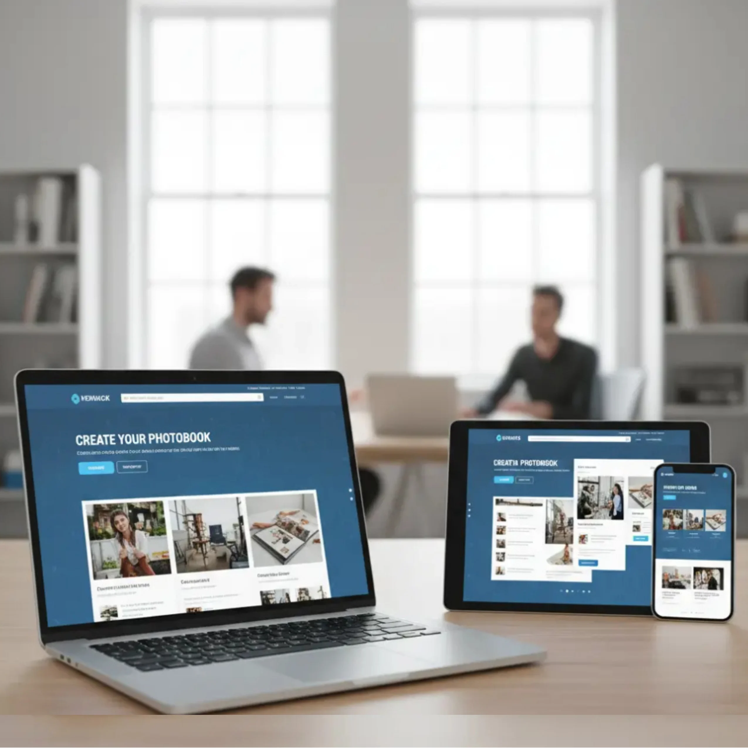
A mobile-first web-to-print strategy ensures customers can design, order, and track print products easily from their smartphones without friction. A mobile-first web-to-print strategy ensures customers can design, order, and track print products easily from their smartphones without friction.
In this article, we’ll explore why mobile-first matters, how to optimize your design tools for smartphone and tablet users, and actionable strategies that will help you corner the fast-growing mobile market.
Why Mobile-First Matters in Web-to-Print
A mobile-first web-to-print approach ensures print customers can browse, design, and place orders seamlessly on smartphones and tablets without friction.
1. The Numbers Don’t Lie
- Over 70% of B2C print shoppers prefer browsing, designing, and ordering on mobile devices.
- Print e-commerce conversion rates rise by up to 20% when the mobile experience is seamless and fast.
- Google’s mobile-first indexing means top search visibility now favors businesses with mobile-optimized sites and tools.
2. Customer Behavior Has Changed
Modern print customers – whether ordering business cards, custom apparel, or photobooks – demand convenience. They want to:
- Start a design on their phone in the café
- Edit it on a tablet during their commute
- Place and track orders from anywhere, anytime
Without a truly mobile-first experience, you risk losing these high-value, on-the-go buyers.
What Makes a Web-to-Print Tool Truly Mobile-First?
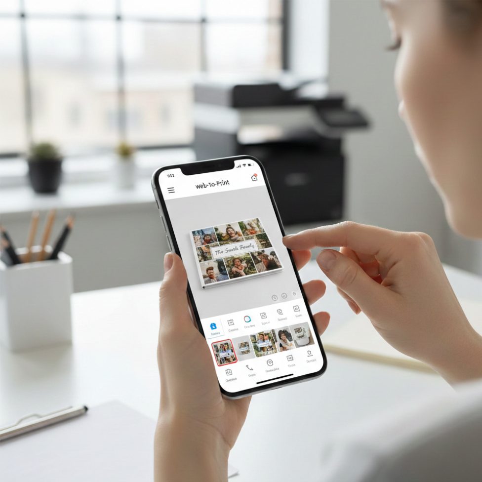
A mobile-first web-to-print platform prioritizes touch-friendly design tools, fast loading speeds, and seamless checkout experiences on mobile devices.
Responsive Design Is Just the Beginning
A mobile-first platform doesn’t just “shrink” your desktop site to fit small screens. It reimagines the entire workflow for touch navigation, quick loading, and thumb-friendly interactions.
Essential features:
- Touch-optimized navigation: Buttons sized for fingers, swiping, not pinching
- Fast, lightweight pages: Minimal load times even on slower mobile networks
- Real-time previews: Instantly see design changes on screen
- Mobile-friendly editors: Drag, drop, resize, and rotate elements with a fingertip
- One-click actions: Easy image uploads, swatches, checkout, and proof approvals
Cloud Integration and Data Sync
Customers expect to start a design on one device, save progress, and finish elsewhere. Cloud-based sync ensures every update and design stays accessible from mobile, tablet, or desktop.
Industry Examples: Leaders in Mobile-First Web-to-Print
- Printbox Mobile Editor: Offers touch-optimized design interface, instant photo uploads from phone galleries, and cross-device saving, resulting in a higher rate of completed orders.
- Printful App: Enables users to create, preview, and manage print-on-demand orders from their smartphones, pushing global expansion and convenience.
Platforms such as Smart Selection demonstrate how mobile-first, user-focused digital experiences help businesses improve customer engagement, streamline ordering, and increase conversions across online platforms.
Practical Tips for a Winning Mobile-First Strategy
1. Test Thoroughly Across Devices
Simulate the full customer journey on multiple devices and browsers. Iron out pain points like slow rendering, misplaced buttons, or awkward text.
2. Simplify Your Design Tools
Keep interfaces uncluttered. Offer only the most-used features on mobile, tucking advanced options behind menus. For example, prioritize quick image uploads and color selection over advanced typography tools.
3. Speed Is Everything
- Compress images and code for speedy loads
- Use progressive loading for design elements
- Minimize pop-ups and unnecessary animations
4. Enable Mobile Payments and Autofill
Integrate secure, mobile-friendly payment gateways and ensure your checkout supports autofill for fast, error-free purchases.
5. Promote With Mobile-First Marketing
Use SMS, mobile push, and social ads to attract and retain customers. Encourage app installs if available and offer mobile-exclusive deals.
Implementation Checklist
- Audit your current site and design tools for mobile performance (use Google Mobile-Friendly Test)
- Choose a web-to-print platform like PrintPoz with built-in mobile optimization.
- Train your team to support customers with mobile queries or issues
- Monitor mobile conversion rates and customer satisfaction; tweak UX regularly
The PrintPoz Advantage
PrintPoz’s e-commerce platform is engineered for mobile commerce. With mobile-first web-to-print capabilities, PrintPoz helps print businesses offer intuitive design tools, one-tap order management, and cloud-synced editing that empower customers to create and order from anywhere.
By adopting a mobile-first web-to-print strategy, print businesses can improve conversion rates, enhance customer satisfaction, and capture the growing audience that prefers ordering on mobile devices.
Explore PrintPoz’s mobile-optimized design experience, and transform casual browsers into loyal customers with every thumb tap.